Versatile. Durable. Affordable. Aesthetically pleasing. What’s not to love about subway tiles?
By tradition, these rectangular tiles are usually twice as long as they are tall. But despite their simple structure, subway tiles lend themselves to many different design possibilities.
It’s the one tile that never grows out of style, so if you’re looking for a failsafe solution to your bathroom or kitchen, here are 7 ways you can incorporate subway style tiles.
Classic subway
Since its early 1900s debut in New York subway stations, the timeless subway tile continues to be a popular tile choice in kitchens and bathrooms. The classic look takes its cue from conventional brickwork using a white repeating bond pattern – often referred to as running bond or offset brick. This white tile, white grout layout creates a seamless effect and is the most common subway tile pattern you’ll come across.
Stack them up
Different lays can add interest to a classic white subway tile. Large subway tiles stacked horizontally bring out a clean and contemporary look to your bathroom or kitchen design. Or, flip them over and install them vertically to evoke height and create an illusion of taller walls and higher ceilings.
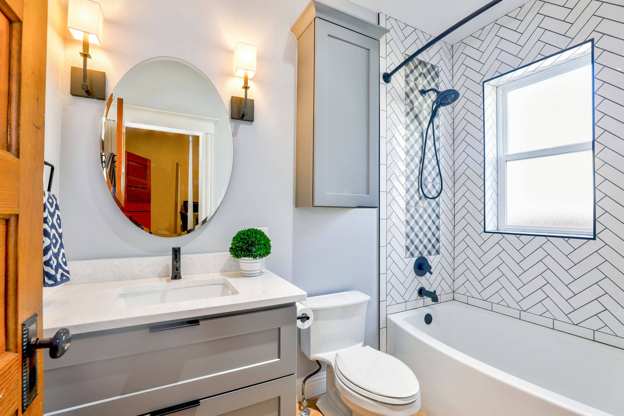
Herringbone at 90 degrees
Named for its similarity to fish scales, this arrangement of rectangles in an L-shaped pattern creates a sense of movement and visual interest by drawing the eye up. In this layout, tiles are arranged so that the end of one vertical tile meets the side of a horizontal tile at a 90 degree angle. It works well for taller spaces like a shower.
If you want to take your herringbone design to the next level, bevelled edged subway tiles will add even more dimension to your space. Many interior designers love this modern look to the classic flat subway tile.
Herringbone at 45 degrees
Another impressive herringbone design is to rotate your subway tiles at 45 degrees. This pattern looks great on floors or walls. It works well for smaller spaces because it keeps your eyes moving around the room making it appear larger than it is. If you want to draw attention to a specific area, then herringbone is the way to go.
Basket weave
Interchanging pairs of horizontally and vertically laid subway tiles creates a grid-like pattern that resembles – you guessed it a woven basket. For the real wow factor, go for a contrasting tile and grout. This will give your weave design a more distinct effect. If you want to be original, a double basket weave pattern will produce an even more modern look.
Mix up the grout
Who said your grout has to be white? One of the easiest ways to modernise your space is to apply a different coloured grout (and it makes for easier cleaning too). Popular choices include black and dark or light grey. Dark grout will make white subway tiles pop out, as will the opposite of black tiles and white grout. If you want to create a more edgy and industrial feel, than a contrasting grout is what you should be aiming for.
Experiment with colour and texture
The original subway tiles were always white, but nowadays subway tiles come in a wide variety of colours, sizes and textures. Make the look of your space your own by experimenting with different shades and surfaces to achieve a trendy yet timeless design. One way you can do this is with colour blocking, which is a great way to break up white tiles.
We’ve all heard how mirrors can help elongate a space and make it look bigger, and you can also achieve the same effect with mirrored subway tiles.
Perth’s tile specialists
Be inspired by Ceramic Tile Supplies’ wide range of premium subway style tiles. Browse our selection of classic and modern designs, or visit our Myaree or Wangara showrooms to view the full range on display.

